In an ad culture dominated by beautiful images — visual representations of products meant to appeal to our desires and imaginations — it’s easy to stop paying attention to individual photos, even if they are sitting on the cover of a magazine, or displayed boldly on a billboard, or hidden in the corner of a Facebook feed. At NYFA, we are training students to create work that breaks through the noise, calms the overstimulated eyeball, and captivates the attentions of onlookers. Our new Fashion Photography workshop will teach students how to create the best images through, in part, the examination of the greatest existing fashion photographs. Here are some of the most elementary steps to creating your own gorgeous image.
Subject: Give your subject icon status.
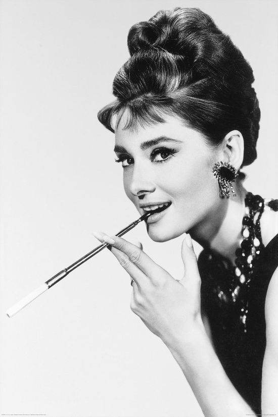
What would a discussion of fashion photography be if it did not acknowledge the quintessential image of Audrey Hepburn in her “Breakfast at Tiffany’s” getup? Though Hepburn’s portrayal of Holly Golightly in the film is what ultimately garnered her the most adoration and respect, the succession of promotional images of her in her black gown and pearls, holding a cigarette, gave her some serious star power. She is also known for her uncommon beauty and her expressive, bushy eyebrows.
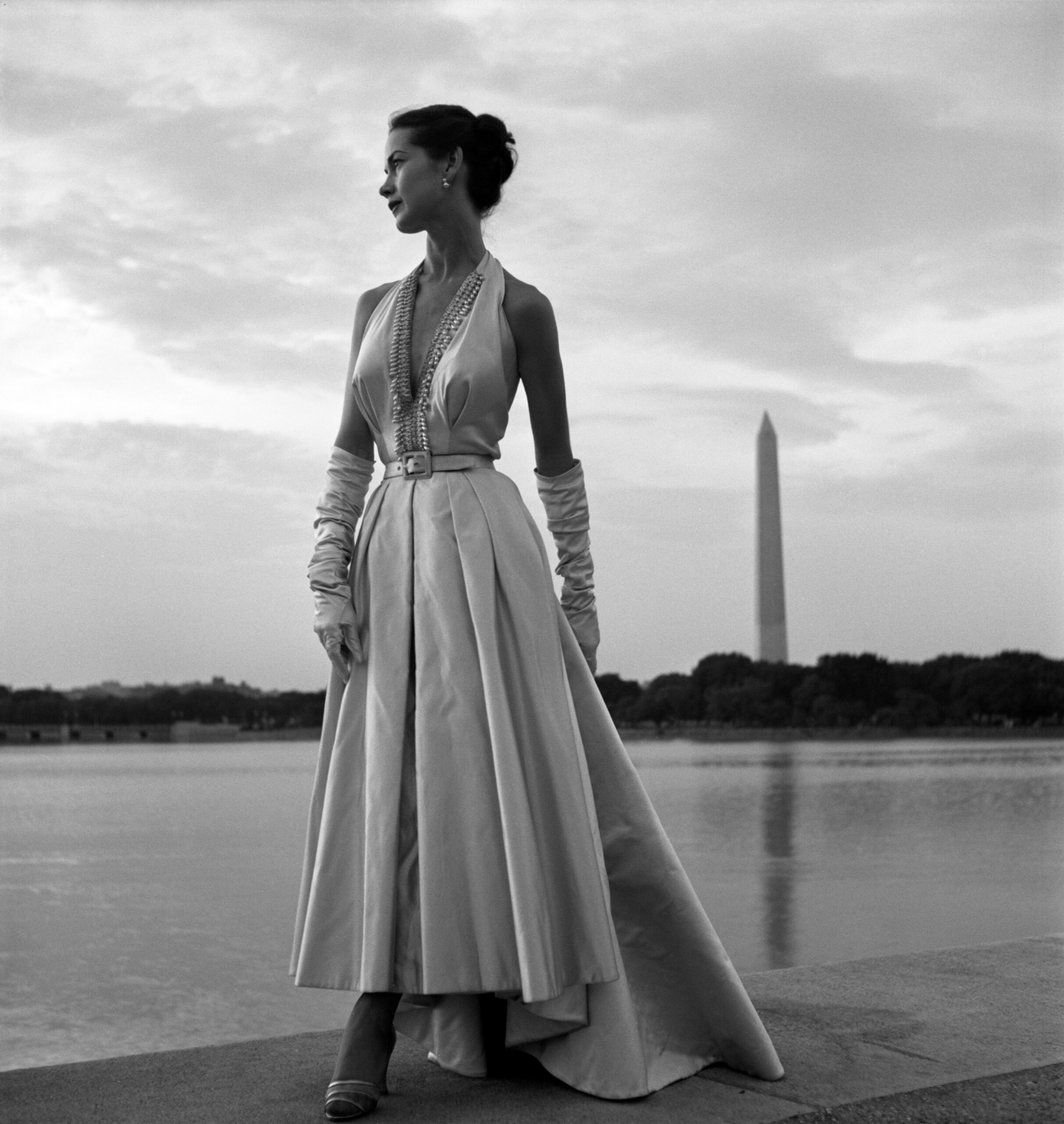
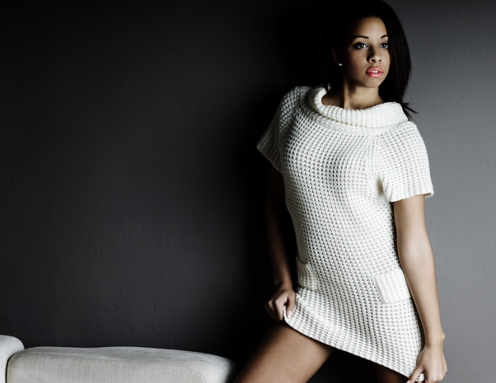
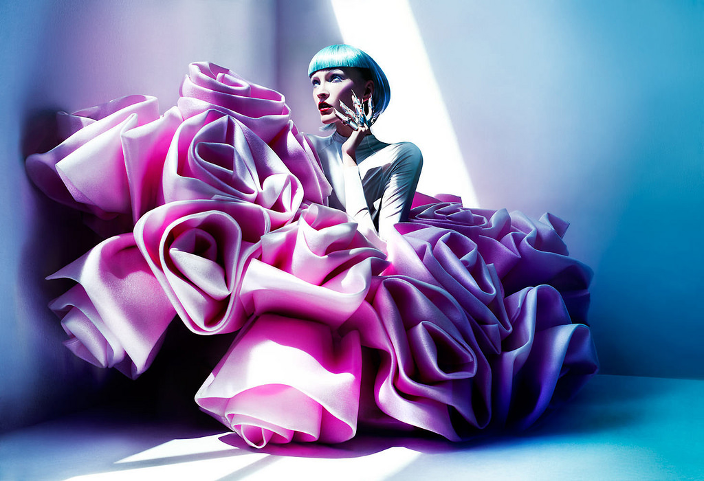
In choosing a subject for your image, it is not necessary that the model fit certain requirements, like having poignant features or unique looks, or adhering to traditional American beauty norms. Rather, the perspective of the photograph, and how it portrays the model, should be special. Give your model a cool hairstyle or a striking costume or a relentlessly emotive facial expression. This can be done in many ways and it is truly up to the photographer’s preferences, in combination with stylists, designers, and other artists.
Staging: Be dynamic.
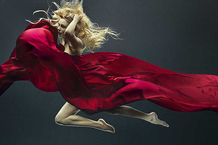
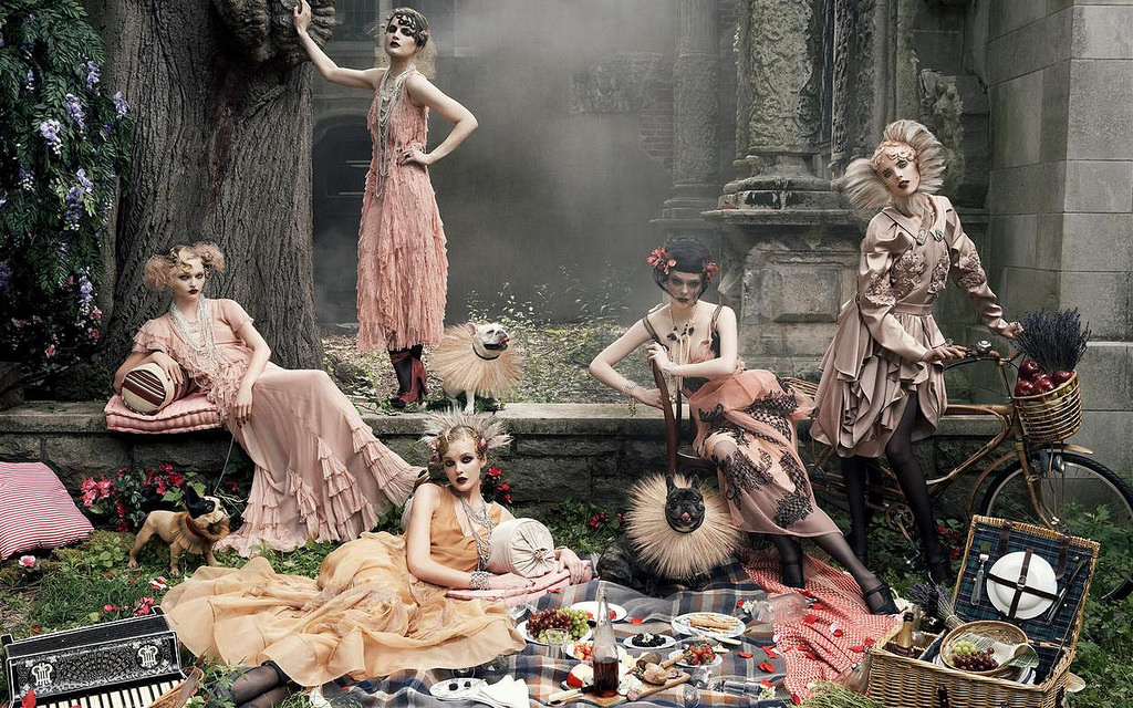
Whether the image shows many models, a focal point model with supporting models in the background, or a single model alone, the models should be positioned in a way that interacts with the rest of the image and/or the camera. They can fill the frame or they can appear to be far away. Regardless of how the image is composed, it should draw onlookers in. A person passing by the image can be surprised by its unique staging, or confused about the actual narrative of the image, or just visually delighted by the way the image has been put together.
Lighting: Play with contrast and shadow.
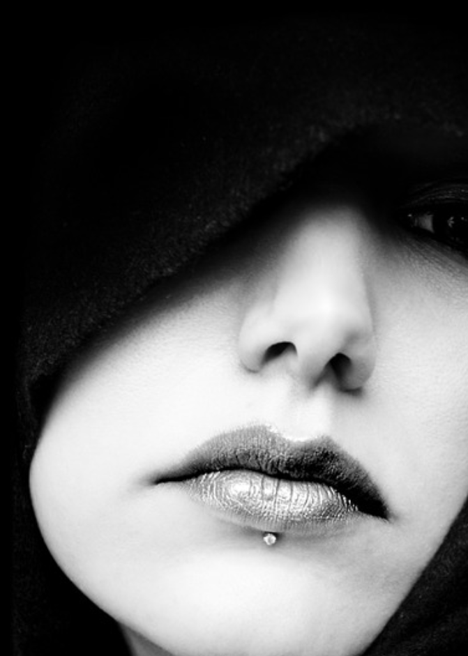
In a fashion photograph, strategic uses of darkness and light are incredibly effective. By its nature, lighting draws attention to what it hits: highlighting it. Beautiful images are taken with a consciousness for the parts that are necessary, or most appealing, to highlight. Lighting can bring emotion to an image. For instance, the use of extreme shadow in Pablo Roversi’s fashion images gives them a certain ethereal quality, one for which the photographer has been recognized time and time again. Also, consider using deep contrast.
Editing: Honesty is beautiful.
Keep in mind the real issues with fashion photography and image editing. Airbrushing and PhotoShop are criticized for making photographs fake, for positing an unattainable beauty standard that is damaging to the general public. Pose this question to yourself: How can I treat these issues without compromising the artistry of my photo? A beautiful image is often created by a great photographer, not a great editor. Our fashion photography program will teach students to build these skills, to discern what must be concealed and what must be exemplified in the composition of an image. We have already considered how a photo can do this in terms of subject, staging, lighting, and editing.
What are the fashion images or icons that inspire your photography? Let us know in the comments below!

