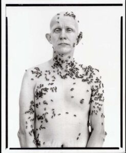
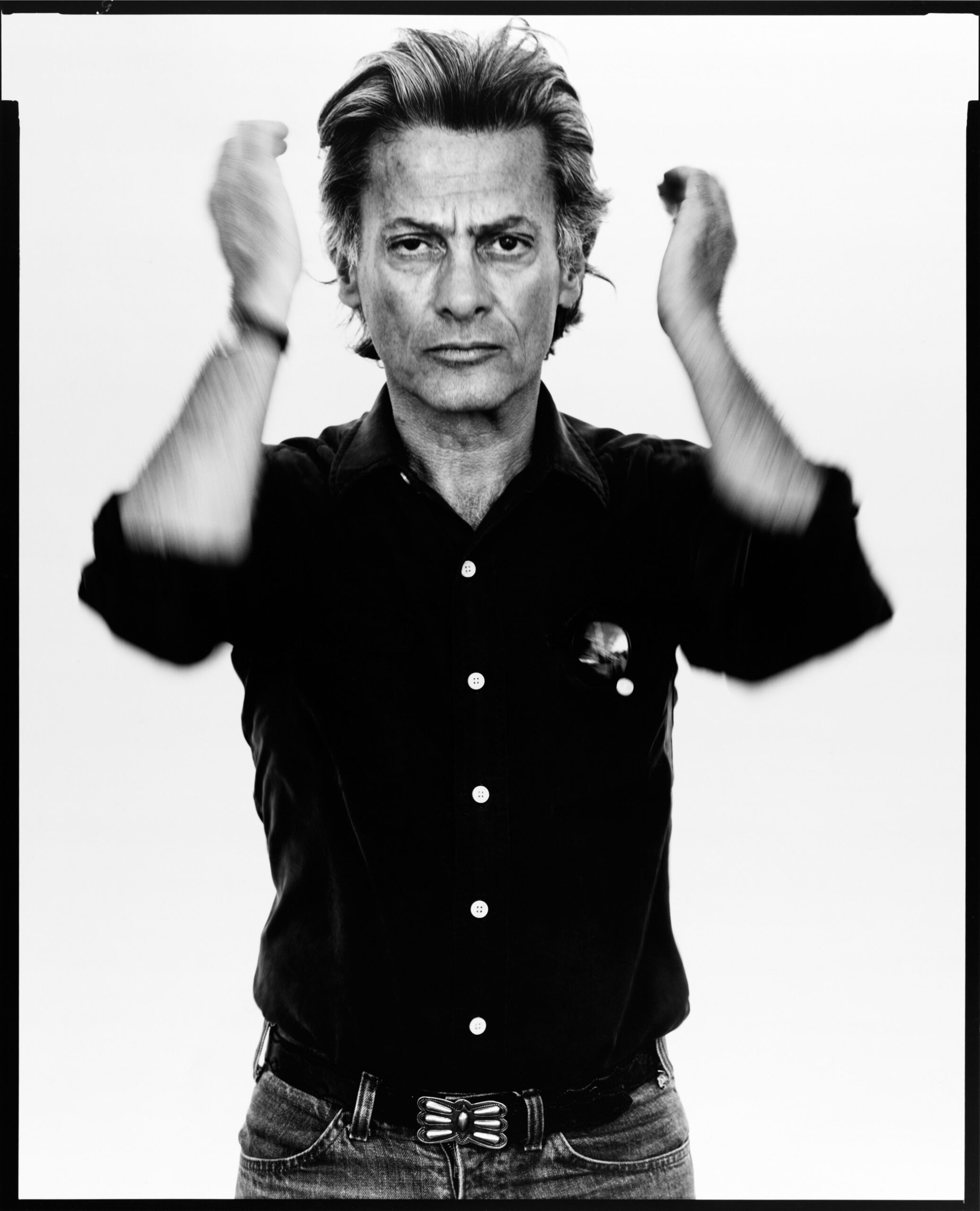
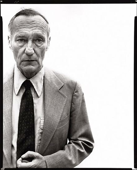
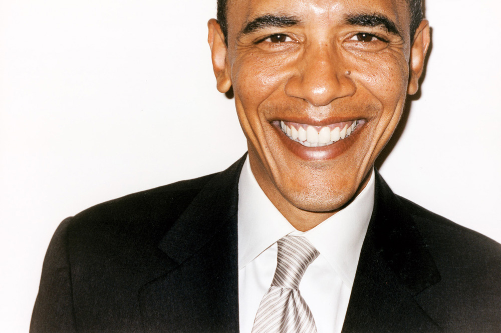
The white background is something that should be talked about in relation to photography, since so many different types of photographers (from fashion photography to art photography to commercial photography) use it in so many different ways. Two notable photographers – Richard Avedon and Terry Richardson – are both known for their use of stark white backgrounds and portraits of celebrities, but in vastly different ways. It just goes to show what creative minds can do with a very simple space.
Richard Avedon
Richard Avedon is arguably the most influential ‘white background’ photographer of all time. It’s almost impossible to enter a photography classroom and find students who have never heard his name. He was primarily an American fashion and portrait photographer, and is well known for his images of celebrities (as well as others) who helped define America’s style and culture. He worked for a handful of fashion magazines, breaking out of the norm of fashion photography of the day to ensure that his models showed emotion in his images – something that many fashion photographers had not done before. Instead of focusing merely on the ‘fashion’ of the time, Avedon used the stark white background to almost force viewers into looking deeper into the emotions of those he used as models.
Terry Richardson
Terry Richardson, on the other hand, is arguably the most controversial photographer of this day (although I hardly want to give him the credit of even having that title). While articles of his mistreatment of young women and models litter the Internet, somehow he still has managed to photograph celebrities such as Miley Cyrus, Lena Dunham, and even Obama. In many of his images, he gets his models to pose as Terry himself, giving them his glasses and posing in the traditional creepy way he usually does (see photographs below). While Avedon shot beautiful large-format portraits on a stark white background, Richardson often uses the white wall of an apartment and any camera he can get his hands on. You can tell when you’re looking at a Terry Richardson image when the models are on a stark white background and a flash has been fired directly at them. He focuses less on the technical aspect of photography and more on his ‘minimalist’ style.
Morten Koldby
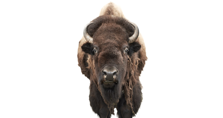
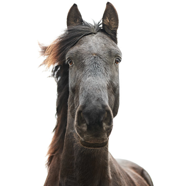
Perhaps a lesser-known name in the photographic world, Danish photographer Morten Koldby also uses the stark white background in his aesthetic – though in a different way than those above. He is most well known for his minimalist animal portraits, all shot on a white background and slightly de-saturated in color. He treats the animals almost as if they are human models, with many of them looking straight at the camera. While he uses human subjects in his work as well, his animal portraits set him apart from the rest.
Andrew Zuckerman
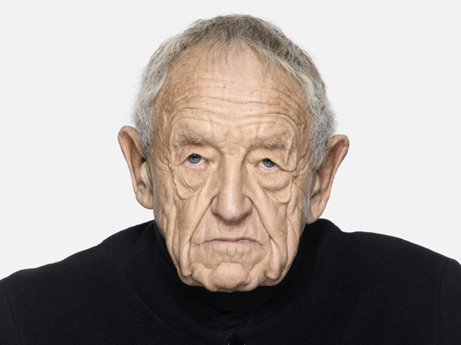
Andrew Zuckerman is best known for his high-definition, hyper-realistic photographs set on, what else, a stark white background. Yet, even he finds a way to make the white background his own – focusing on subjects ranging from humans to birds to flowers. Looking at a Zuckerman photograph, you can almost feel yourself right next to the real subject he has photographed. His images are so sharp and so clean that it’s almost impossible to tell what is an image and what is real. The only thing keeping you from jumping away from an image of a huge bird with its wings outstretched is the fact that it – luckily – is only 2D.
Commercial Advertisements
When speaking about white backgrounds in photography, it’s almost impossible to overlook that fact that many commercial photographs (often used in advertisements) are taken on a white background as well. Take a look at the CoverGirl advertisement below:
There’s a beautiful lady on a perfectly white background, yet how does she differ from the models that Avedon or Richardson use in their photographs? Since this photograph has been transformed into the ad it is supposed to be, it’s easy to determine the fact that this photograph is used to sell a product. Oftentimes, commercial photographers use white backgrounds and negative space to give companies a clean slate on which to write their copy. But would this photograph still be considered “commercial photography” if the completed ad was not placed on top of it? While it can certainly be argued that Avedon, Koldby, and Zuckerman’s photographs are all more emotive and thought-out than the CoverGirl ad, are Richardson’s? Where does one draw the line between commercial and art – especially when the subjects and background are seemingly the same?
While some photographers feel too confined and limited within a studio space, the white background offers almost limitless possibilities. Since photographers cannot rely on context to create an interesting photograph, they are forced to think outside the box and create an image that is full of emotion and power. What would you do if all you had was a white background?

